Interior design in 2026 is moving in a quieter, more intentional direction. Top designers are stepping away from trend-heavy looks and leaning into spaces that feel calm, grounded, and natural. Styles like Japandi and Warm Minimalism are shaping the conversation, with an emphasis on warmth, texture, and simplicity that feels lived-in rather than styled for impact. The focus is on materials that age well, colours that feel comforting, and homes that support everyday life instead of following a formula.
At the same time, designers are openly calling time on once-popular aesthetics that now feel tired. Modern Farmhouse and Mid-Century Modern, for example, are increasingly seen as overdone and predictable when applied without restraint. The shift is not about rejecting personality, but about choosing design elements that feel timeless instead of tied to a specific era or trend cycle. The result is a move toward softer palettes, natural finishes, and spaces that feel cohesive, warm, and intentional from room to room.
Here is what designers are officially moving away from in 2026, and what is replacing it.
Out: White Shaker Cabinets
White shaker cabinets have dominated kitchens for well over a decade. They were safe, familiar, and easy to pair with almost anything. But after years of repetition, they now feel generic. In many homes, they read as builder-grade rather than custom. Designers are seeing clients ask for kitchens that feel warmer and more personal, and white shaker no longer delivers that.
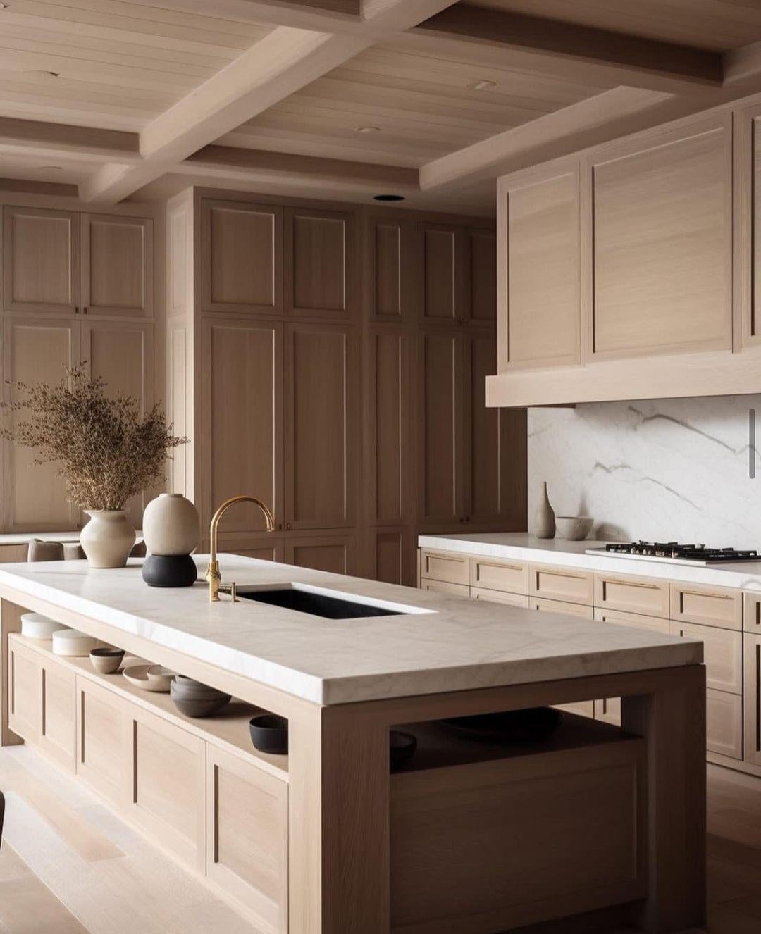
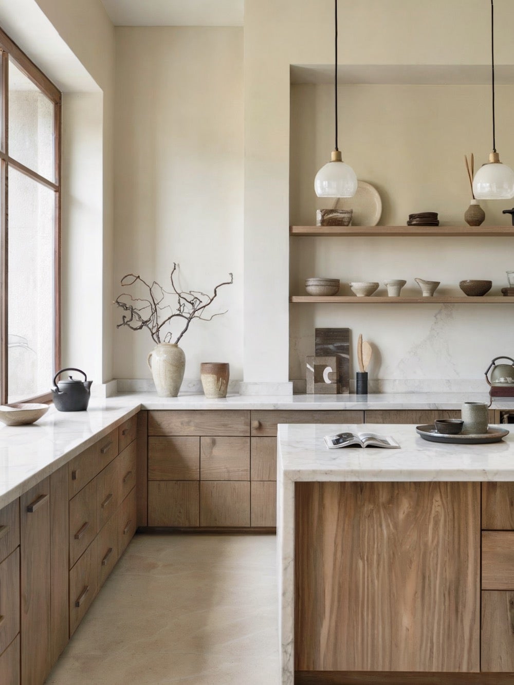
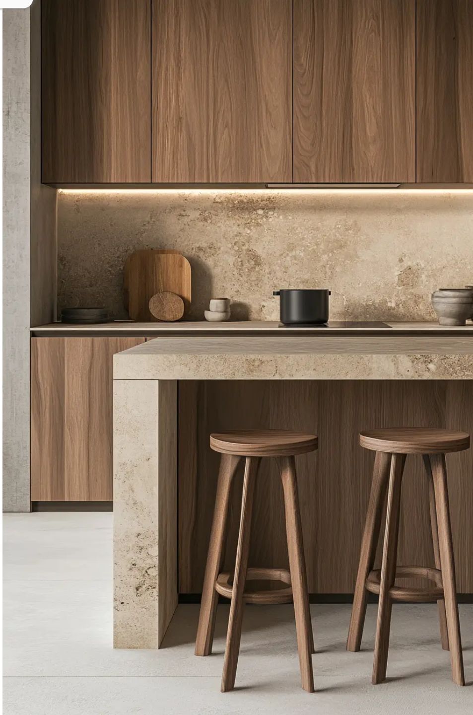
In: Natural Matte White Oak
White oak has become the new go-to for cabinetry. Its subtle grain and warm undertones add depth without overwhelming a space. The matte finish is key. It feels natural and refined rather than glossy or trendy. White oak works beautifully in both modern and traditional homes, which is why designers see it as a long-term choice rather than a passing trend.
Out: Grey and Greigh
Grey was once the perfect neutral. It felt modern and clean, and it photographed well during its peak. But cool greys are now starting to feel flat and lifeless. In many homes, they make spaces feel colder than intended, especially in the natural light we get here in BC.
In: Warm Neutral Paint Colours
Warm neutrals are taking over. Think soft taupes, off-whites, and creamy beige tones that lean warm rather than cool. These colours make rooms feel calm and welcoming, and they complement natural materials like wood and stone far better than grey ever did. They also age more gracefully, which matters if you are renovating with resale in mind.
Out: White Ceiling and Trim
For years, white ceilings and trim were treated as the default finishing choice. The problem is that this high-contrast look can make rooms feel chopped up and less cohesive. It often draws attention to lines and edges instead of the space as a whole.
In: Colour Drenching
Colour drenching means painting the walls, trim, and ceiling the same colour, or very close to it. The result is a space that feels intentional and layered. Instead of breaking a room into pieces, colour drenching wraps it in one continuous tone. Designers love this approach because it adds depth without relying on busy finishes or decor.
Out: Green
Green had a strong run, from sage cabinets to olive walls to forest green accents. While it is not disappearing entirely, designers agree it has been overused, often dubbing it “Millennial Grey”. When every home leans on green, it stops feeling special.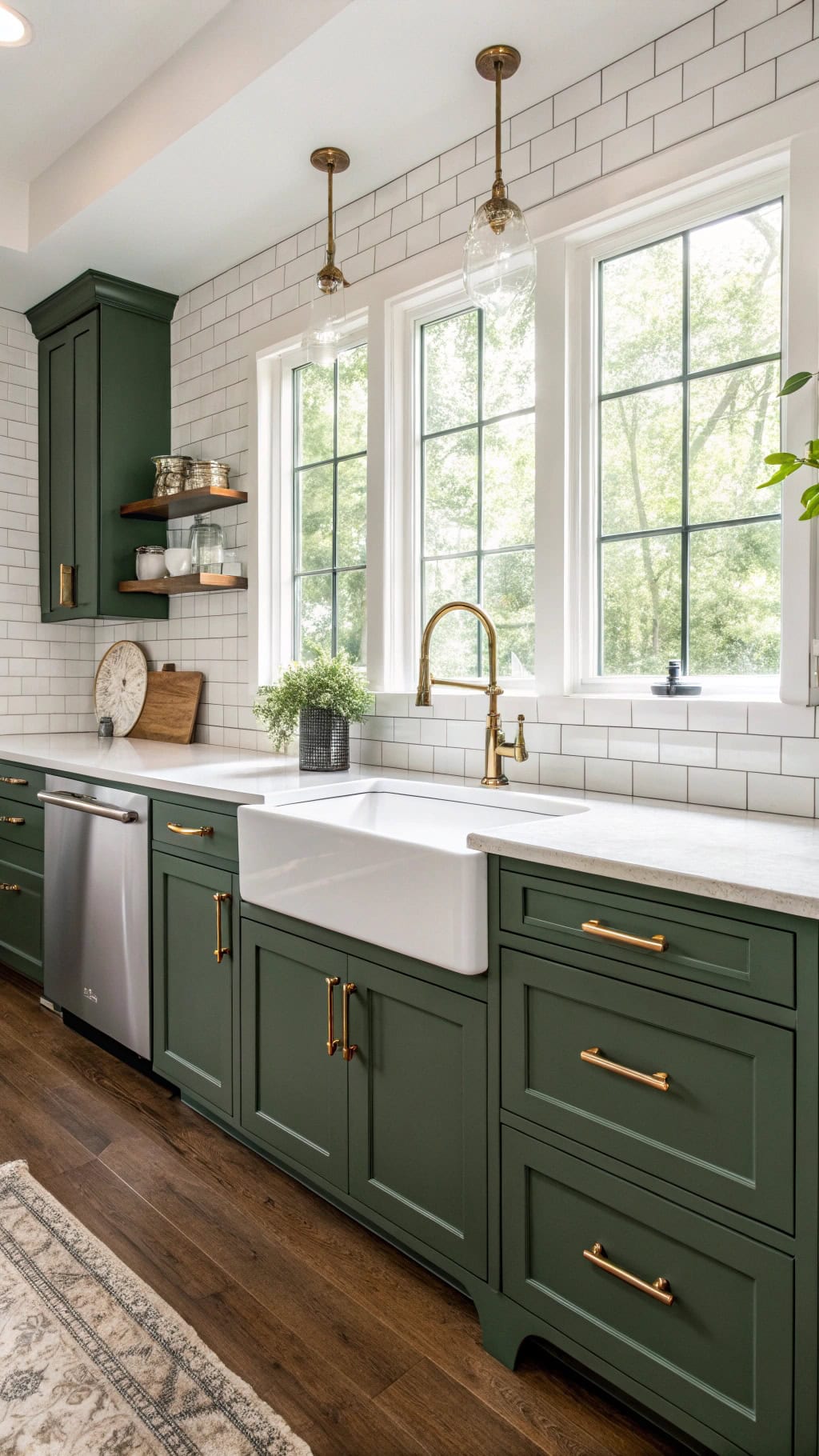
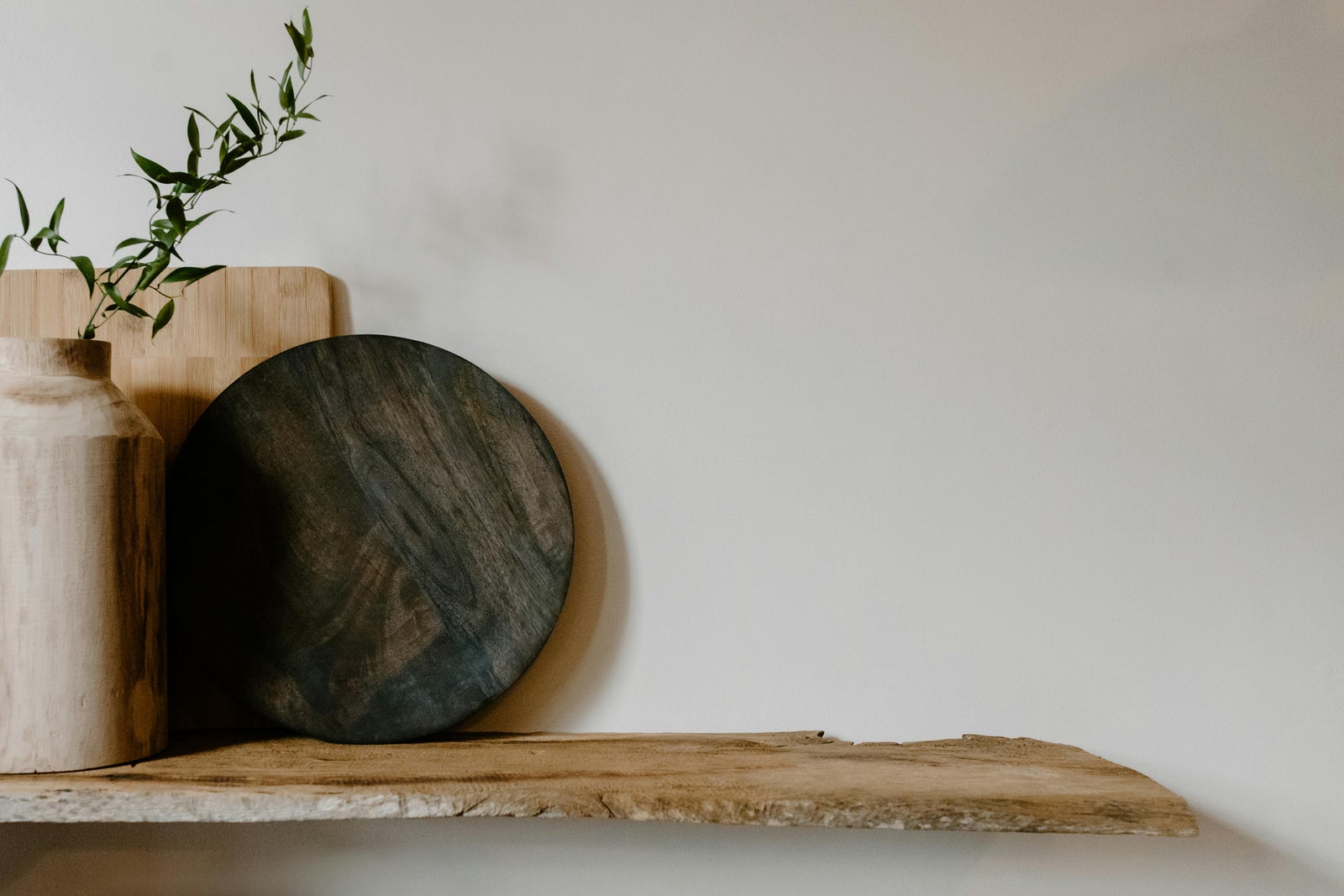
In: Mid-Tone Browns Like Chocolate and Walnut
Mid-tone browns are stepping in as the new grounding neutral. Chocolate, walnut, and tobacco tones add richness and warmth without overpowering a room. These colours feel classic and pair well with both light and dark elements. Designers see brown as the next long-term neutral that will age better than trend-driven greens.
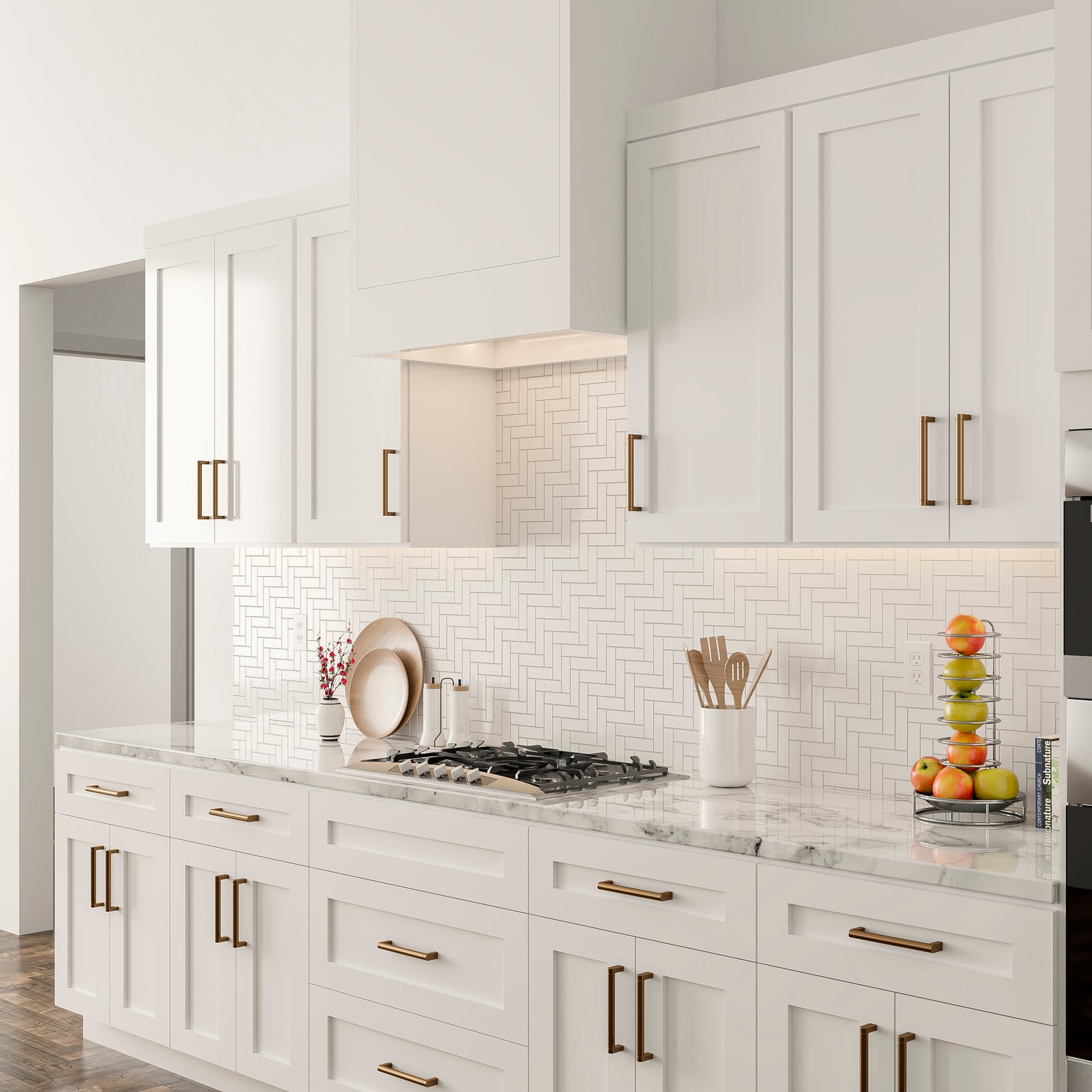
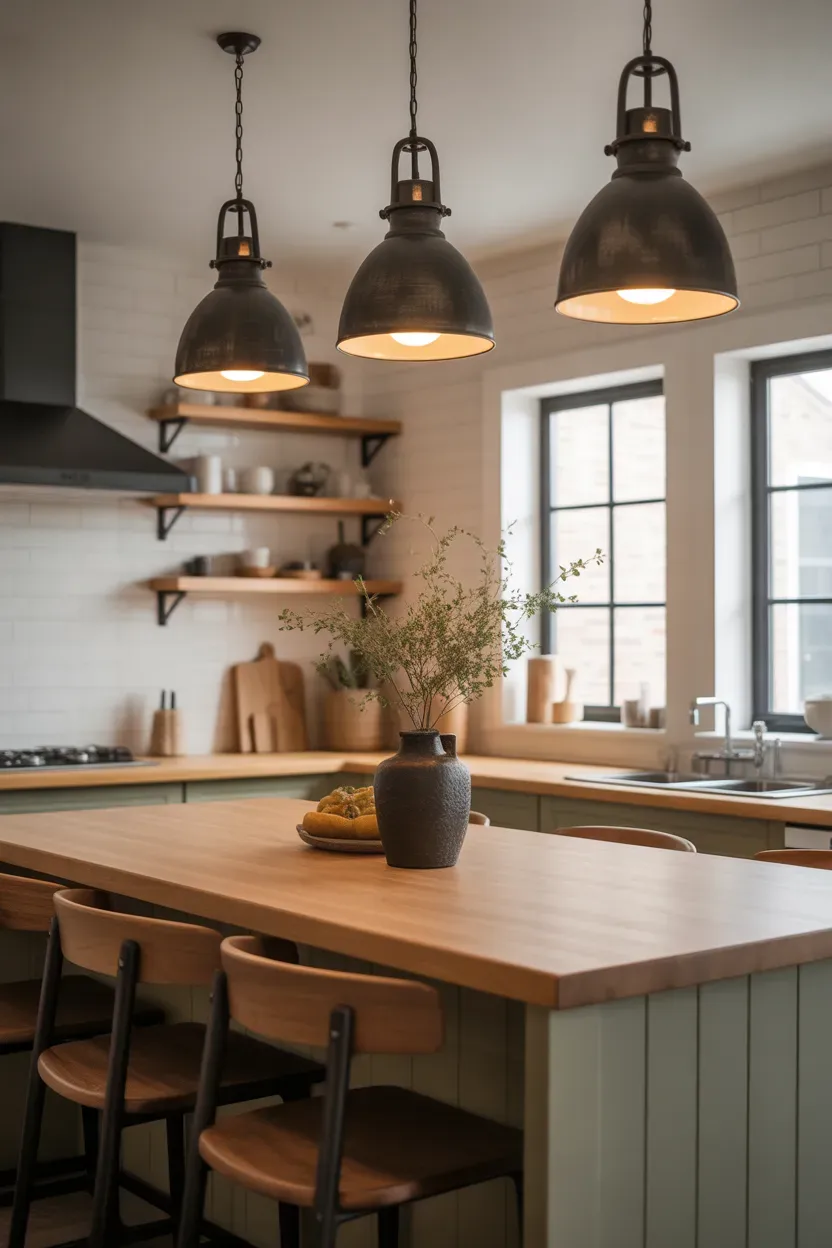
Out: Big Clunky Kitchen Pendants
Oversized kitchen pendants were meant to make a statement, but in many kitchens they do the opposite. They can make the space feel heavy and crowded, and designers often joke that they turn islands into warming stations rather than focal points.
In: Sleek Bullet Lights, Mono Points, or Mud-In Cans
Minimal lighting is taking over. Slim bullet lights, mono points and mud-in recessed cans provide clean, even light without stealing attention from cabinetry, countertops, or millwork. This approach makes kitchens feel calmer and more modern, and it allows the finishes to do the talking.
Why These Trends Matter for Homeowners
Design choices are not just about personal taste. They also affect how a home feels to live in and how it is perceived when it comes time to sell. Buyers are becoming more design-aware, and many can spot dated choices instantly. A home that feels warm, cohesive, and thoughtfully updated often stands out, even in a slower market.
That does not mean chasing every trend. The best updates balance current design direction with timeless materials. Many of the 2026 trends reflect that balance. Natural wood, warm neutrals, and intentional colour choices are less likely to feel dated five or ten years from now.
If you are planning a renovation, refreshing a space, or thinking ahead to resale, it helps to understand where design is headed and where it has clearly peaked. If you want to talk through updates that make sense for your home, your budget, and the current market, I’m always happy to help you plan your next move with confidence.